Part of the writing process is presentation – getting the book or article into a format that can be viewed by the target audience. Most of my books are written to be published online. You’d think that I’d have become used to the process by now …
My beautifully presented book has been styled to look the part. Its images have been carefully crafted. Its fonts have been chosen to reflect the weightiness of the words. Its layout has been designed to be pleasing to the eye.
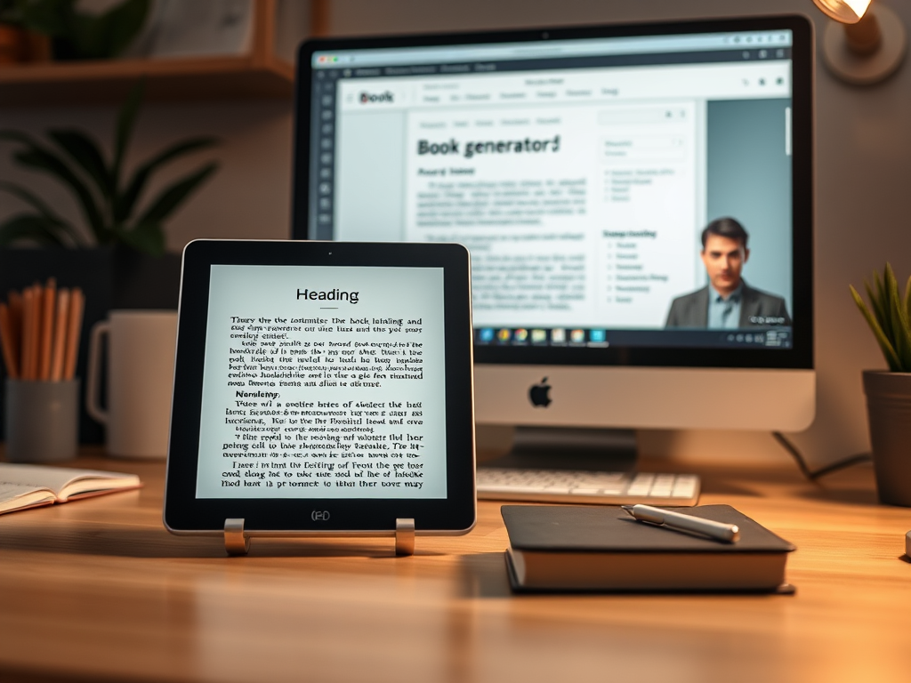
Then I put it into a book generator – [gasp!]. Sounds familiar? For those of you who don’t write books but support we struggling authors by buying them, take a peek inside the tent of our anguish!
Essentially, unless your book is practically plain text – not forgetting a Heading 1 tag to indicate chapter breaks – then you may be disappointed with the output once it’s converted to HTML or into an ePub format. By a process of trial, error and much stamping and swearing, I’ve come to the conclusion that the book content’s format should be as simple as possible.
If you have any layout that depends on tabulation, be aware it may break. Correction – it will break. Chunks of text separated by tabs behave with a mind of their own, as I have discovered in producing my work, A Student Guide to Effective Research Questionnaires and Surveys. Questionnaires, by their very nature, have tick boxes next to words or numbers. These are then separated out by tabs. It looks fine in Word, not too bad in HTML, but when you come to test the ePub, it’s all over the place.
The same can happen with images. Watch out for full-width images suddenly deciding to over-run margins, half-width images blowing themselves up to full-width or images simply disappearing for no apparent reason.
Then there are styles. You may think that a number of neat styles for different headings would be a cool thing to do. Don’t do it! They gain a mind of their own and will render in random colours, sizes and fonts. Check back to the source document and it all looks fine. What’s gone wrong?
My advice? Start from a very plain text only document. Add the minimum number of styles you can get away with – for fiction, it’s probably body and chapter title. Add images slowly and with caution – don’t invoke any wrapping or suchlike – just make a gap and drop the image in. Where you use tabs to carefully align content in columns, consider rendering them as images instead – and then beware how the images behave. Keep all images inline, locked with the text to which they are associated. Keep wrap turned off.
And don’t forget that e-readers don’t like fancy fonts. Moreover, the user may choose any of the selection of fonts at their fingertips and then choose their own size, overwriting any plan you may have. Therefore, render everything down to the simplest and most basic approach. Select a standard sans-serif font (Arial or Helvetica, for example) or serif font (Times New Roman, for example) and stick with that. Make your styles for titles and so on simple variants of the chosen font – bold, italic or change of size.
Remember, your 12-point Arial text may be read by a sight-impaired person at 24 point or higher. Layout breaks. Keep it simple.
© 2026 Nick Evans
Image created by AI Assistant in WordPress
Leave a Reply